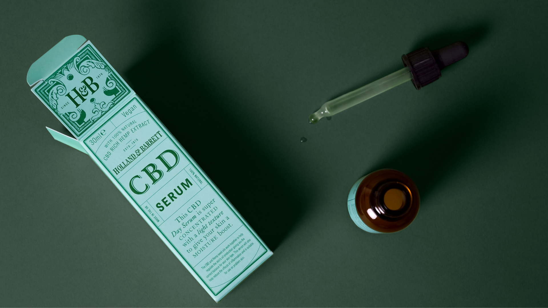
Holland & Barrett | CBD
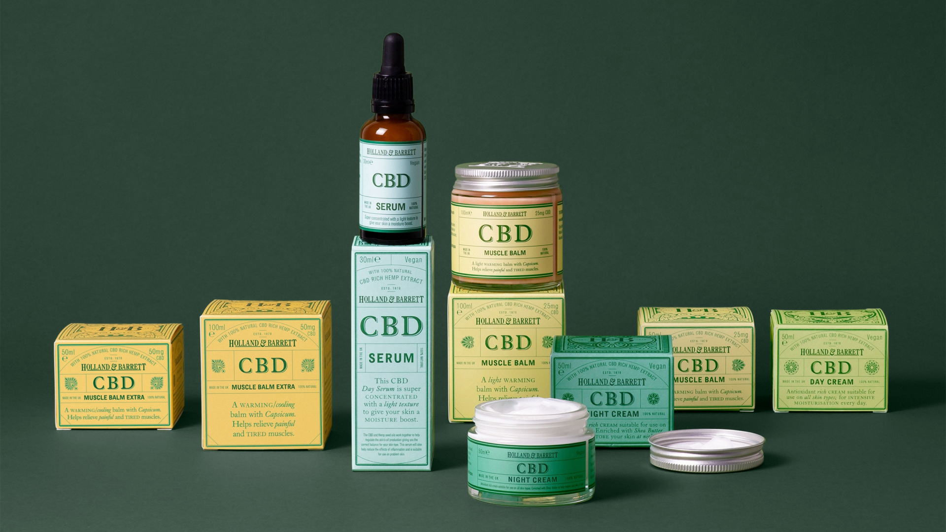
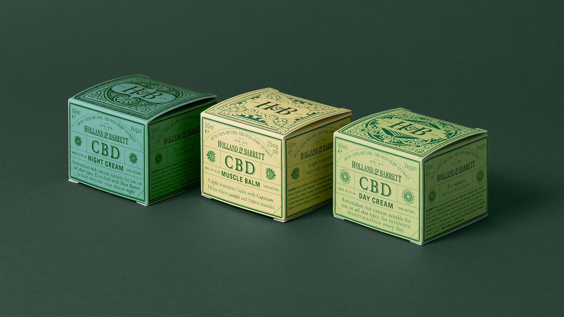
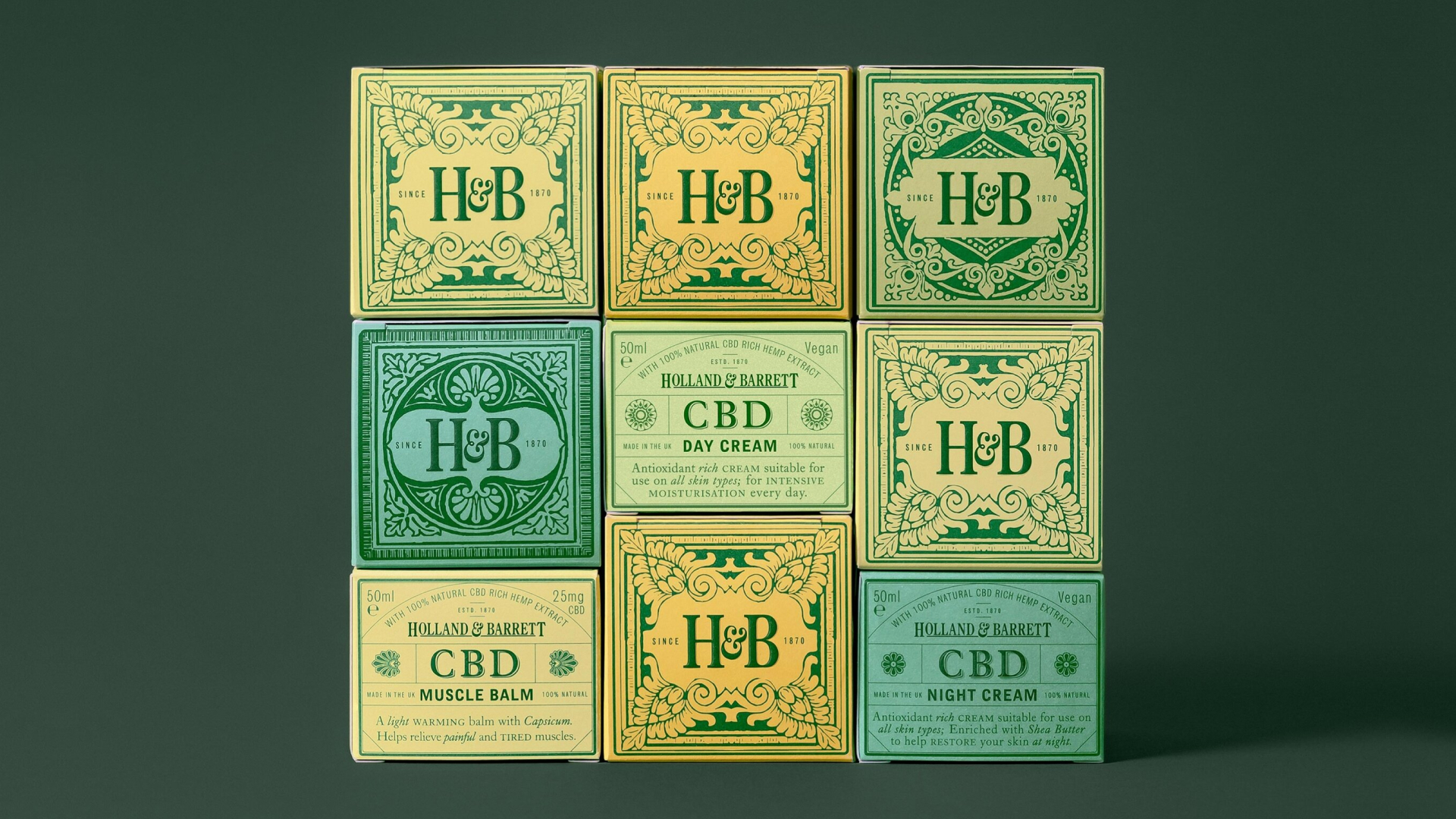
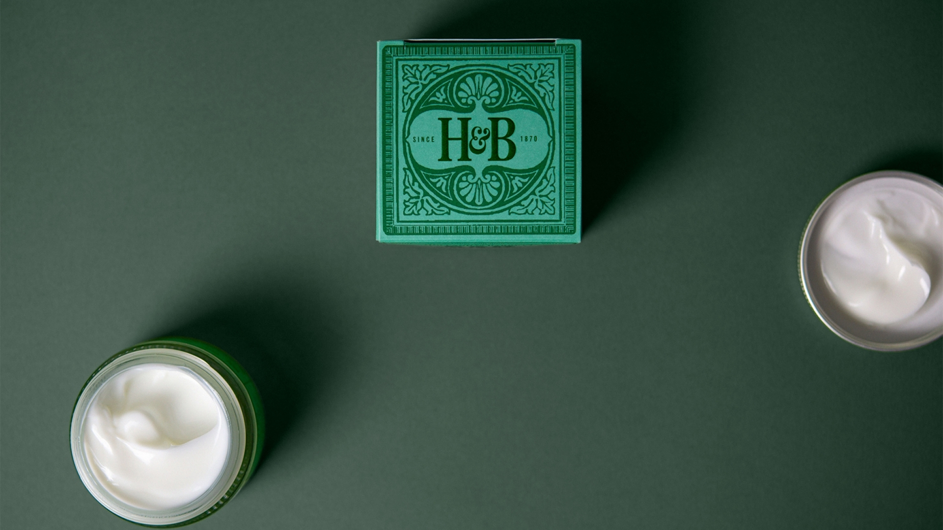
Inspired by traditional apothecary design, this identity helped Holland & Barrett seamlessly introduce their CBD range into the modern market. Unlike the minimalist, clinical look adopted by many contemporary CBD brands, the design draws on Holland & Barrett’s rich heritage and the natural motifs found in historic apothecary graphics. Each product carries its own 19th-century-inspired pattern, abstracting flowers and leaves to reflect the ingredients within and give the range a crafted, trustworthy character. Gentle pastel packaging and a warm, reassuring tone of voice evoke CBD’s calming effects, while ensuring the products stand out clearly on shelf.
Scope
Packaging design
Typography
Illustration
Positioning
Art Direction
Typography
Illustration
Positioning
Art Direction
Credits
Studio
Here Design
Client
Holland & Barrett
Here Design
Client
Holland & Barrett